Background(Why i decided to work on this project)
I recently started following Carbon and was impressed by the problems they are working to solve for everyday Nigerians. After downloading the user-friendly mobile app, I became more interested and explored their website to see if similar transactions were possible online. The website experience was great, and I successfully logged into my Carbon account. However, I believe the user dashboard could be improved to better support web-based transactions.

What did I decide to do about it?
I took it upon myself to redesign the existing dashboard and also implement a new style that gives a modern look and feel in general, as well as improve the functionality of the dashboard, thereby helping users complete simple tasks in shorter time frames without needing to be guided through the process.
Goals
Improve usability: The key goal of this project is to make it easier for users to navigate and access the information they need. This involves simplifying the interface and reorganizing the layout to improve the user experience.
Increase engagement: Another goal was to encourage users to spend more time on the dashboard by making it more visually appealing to keep them engaged and interested.
Increase efficiency: redesigning the dashboard to help increase operational efficiency by streamlining workflows and reducing the time it takes to perform certain tasks
Evaluating the existing design
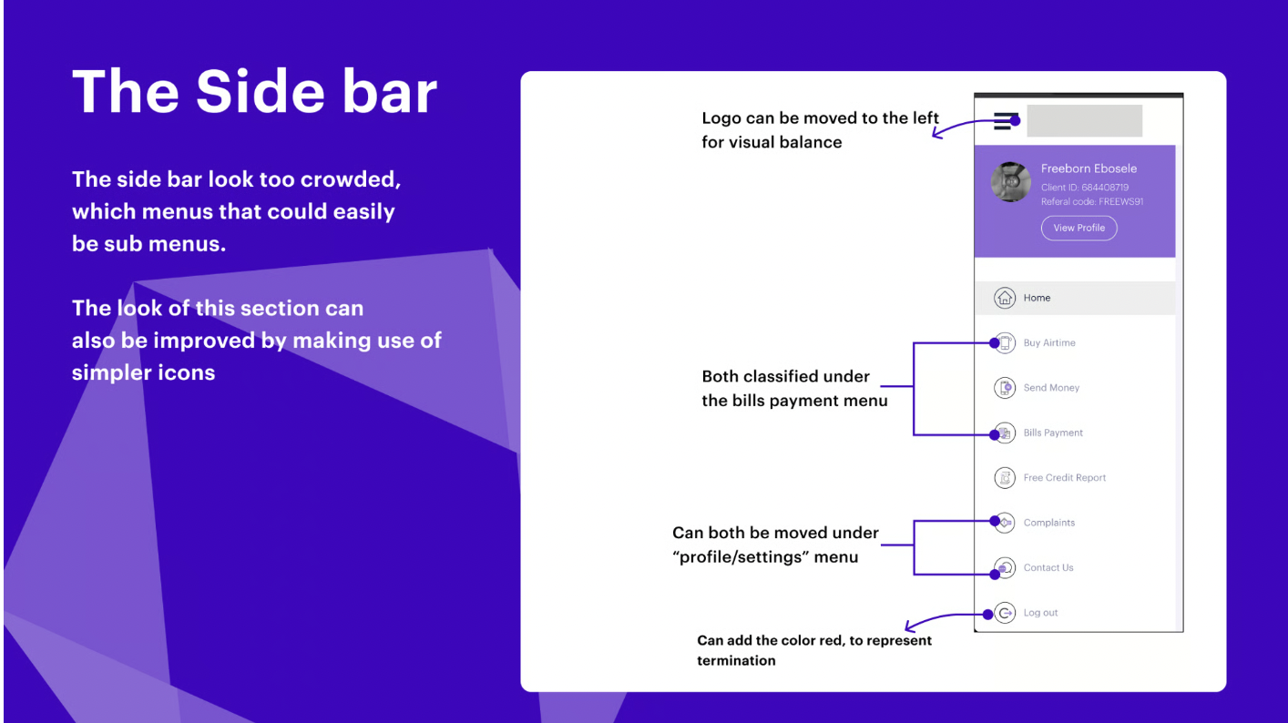
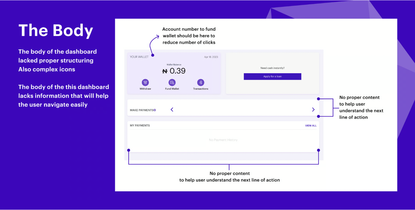
First off, I evaluated the existing dashboard properly and compared it with similar dashboards from other competitors (competitors I choose not to disclose), and below are some of the things I picked up:

Creating Harmony
I wanted to do this quickly but also ensure that my design decisions were goal-oriented. After my evaluation of the existing dashboard, I proceeded to define a style guide that I would use across the page.

My design
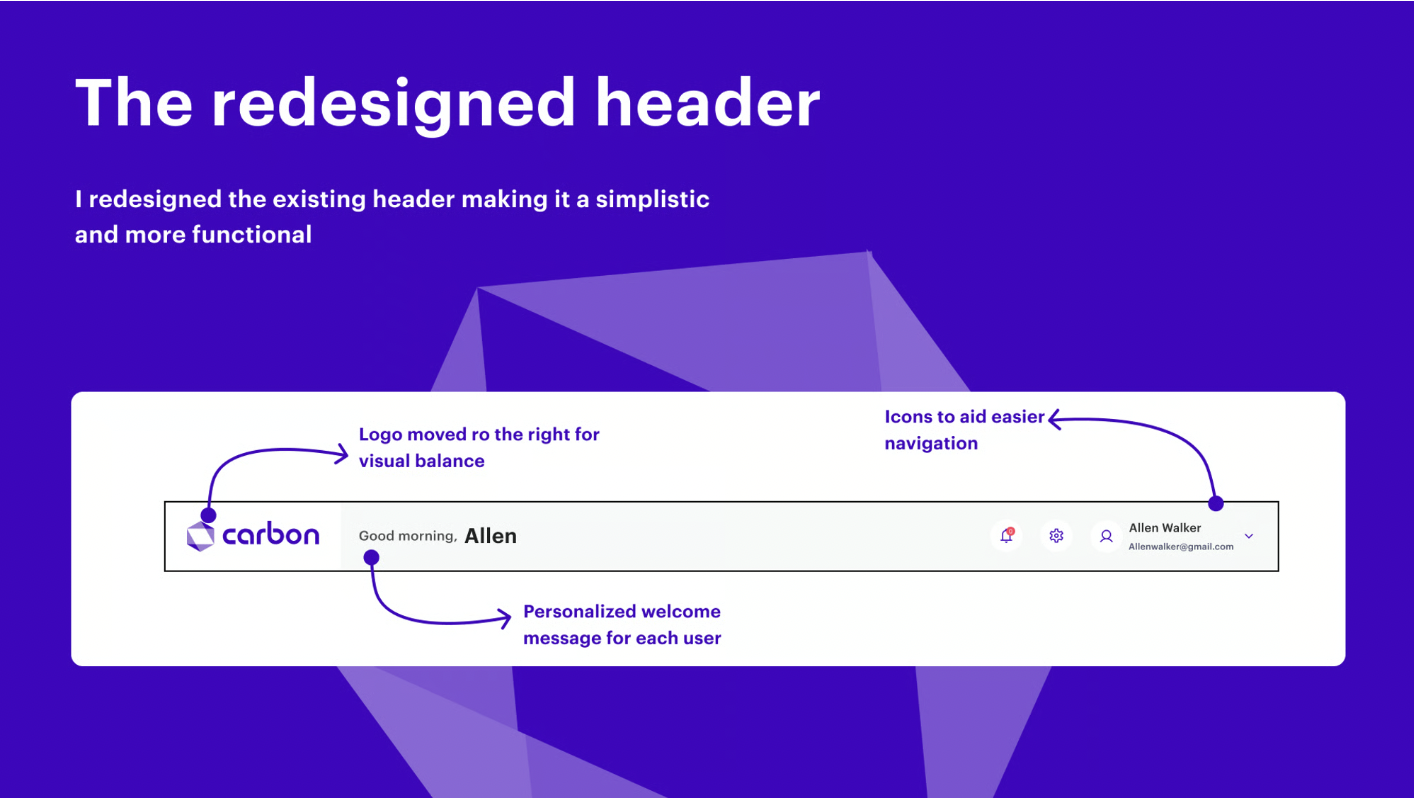
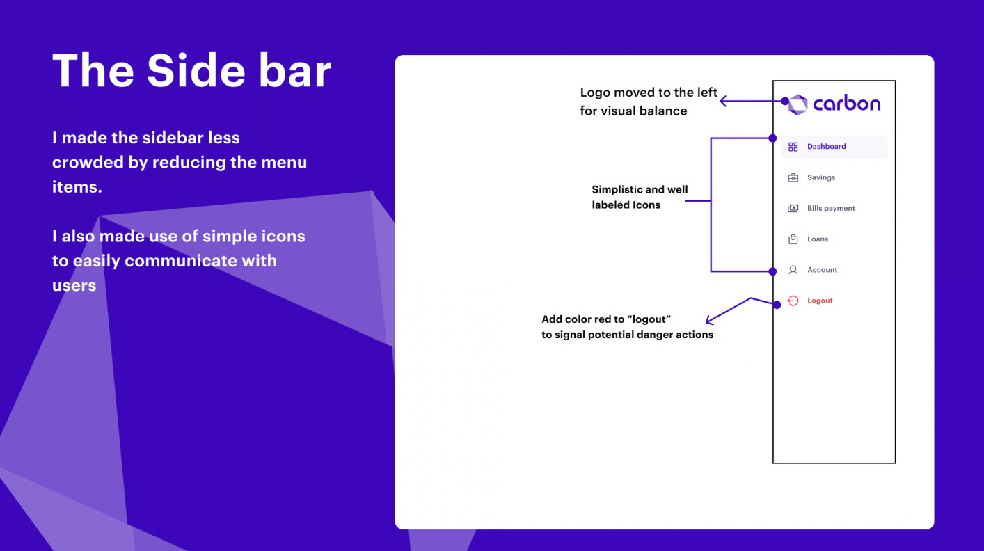
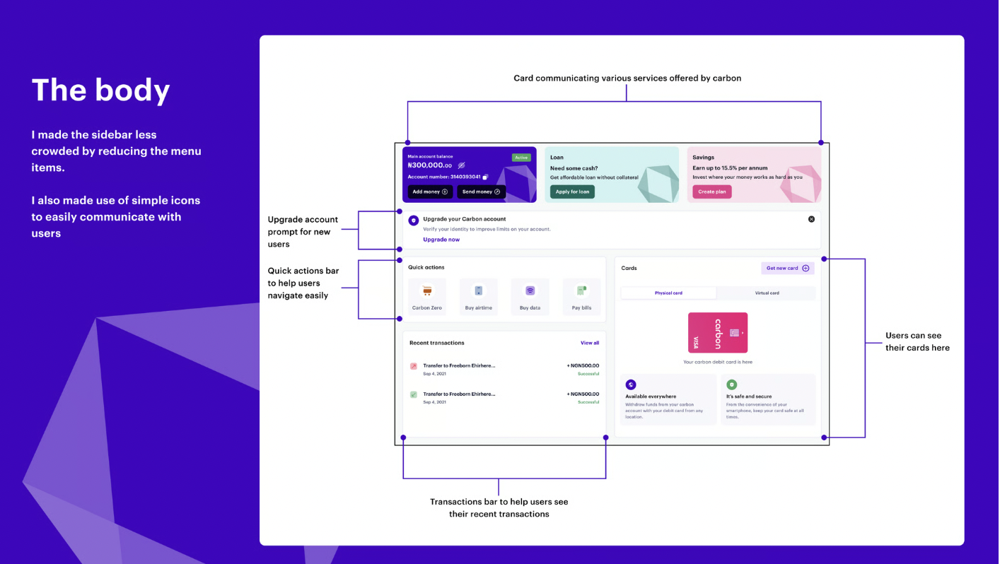
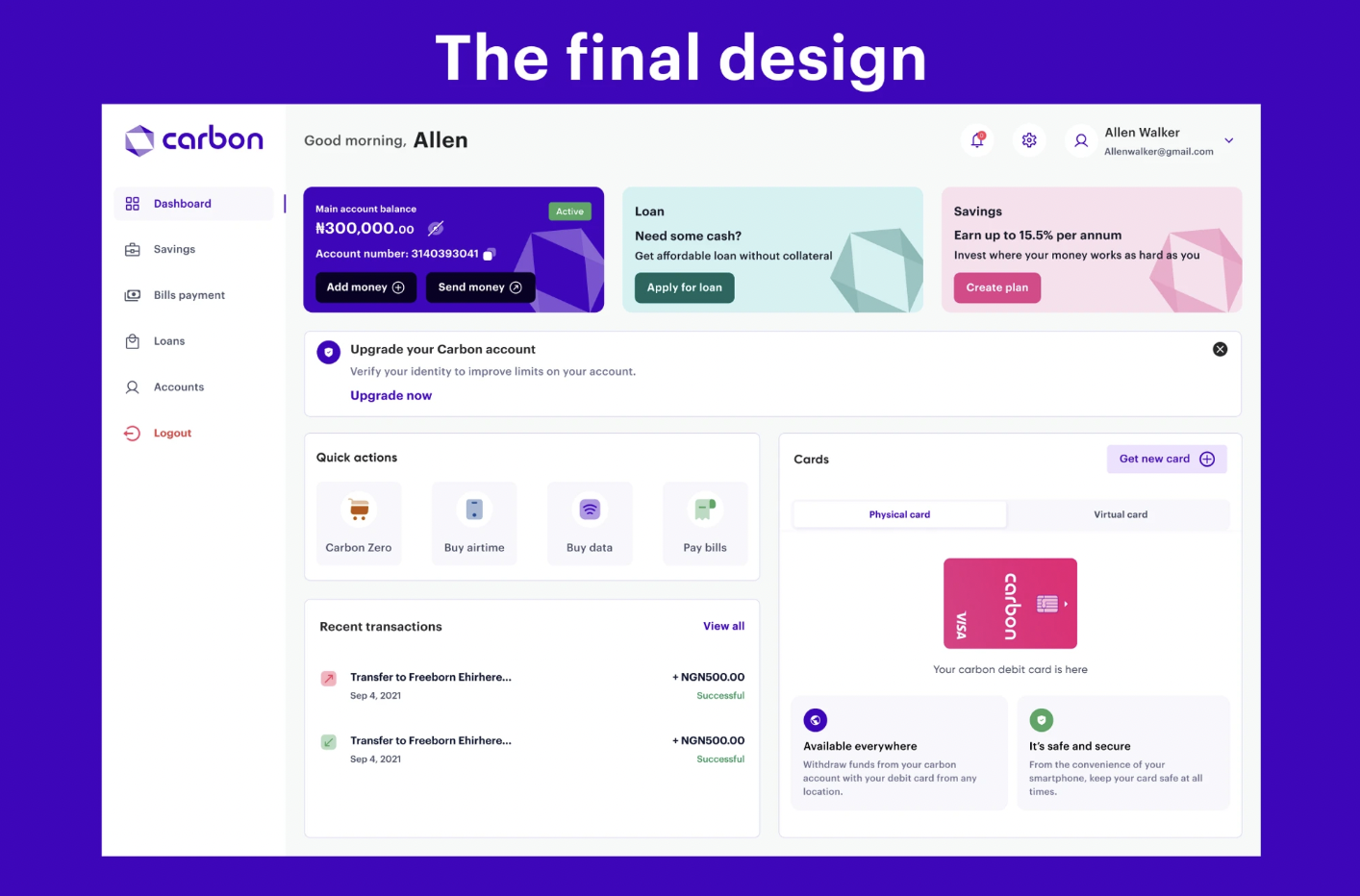
Building on my earlier evaluation of the current dashboard and the redesign concepts, I began bringing those ideas to life. My goal was to engage users with eye-catching visuals that promote the brand by intentionally placing key information where it’s most visible, while prioritizing data in a way that’s more useful and accessible to anyone using the dashboard.
Conclusion
This project was truly engaging and reinforced the importance of setting aside assumptions and embracing a human-centered approach to design. It taught me to focus on creating intuitive, user-friendly digital products that deliver real value while providing an exceptional user experience.
You can reach out to me on LinkedIn for your intended project.
Thank you for reading.